Kenny Lopez
Canopy
2016
Canopy is an online education platform that equips aspiring stock traders with the right tools to enable them to make smart investments and to communicate with professionals about their trading strategies.
For this client project, we were tasked with creating Canopy’s first mobile-optimized website where users learn how to trade stocks.
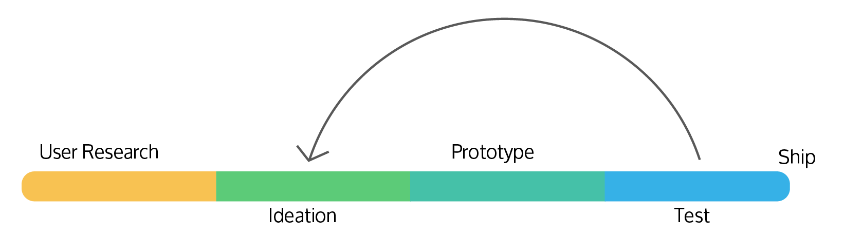
During the development phase, I worked on the User Experience and Interface components. I then created the clickable prototypes using Pixate.
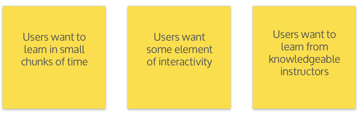
We created an interview guide to investigate user behaviors around learning preferences and motivations and pain points around personal finance. We interviewed two groups of people:
From this procedure, 3 main pain points were discovered.
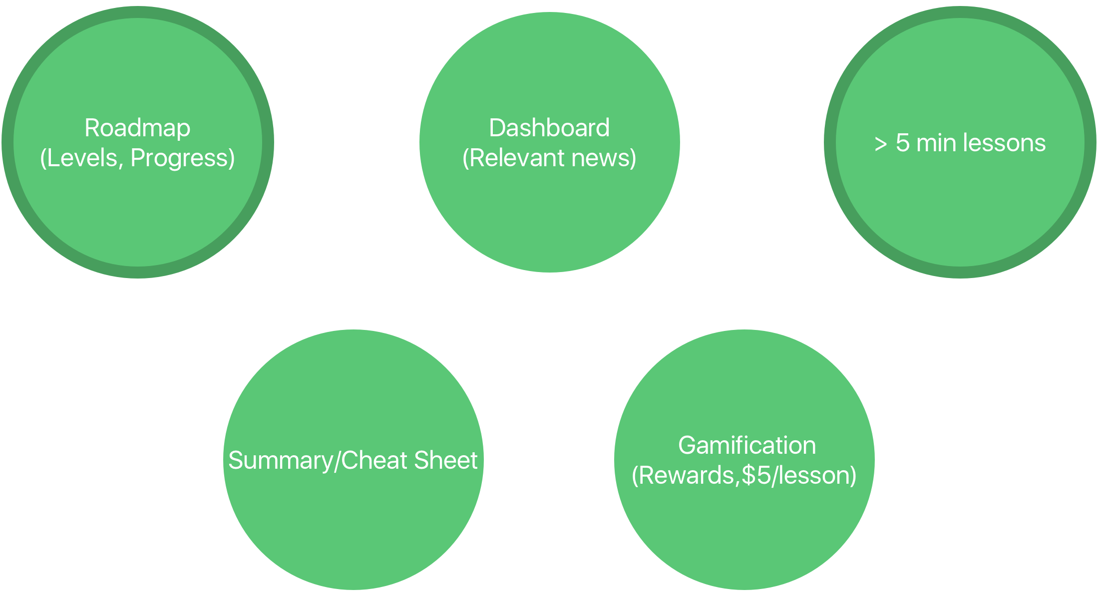
During the brainstorming process we narrowed in on the following top 5 ideas. From these 5 we decided to move forward with our our top 2, Roadmap and Short Lessons.
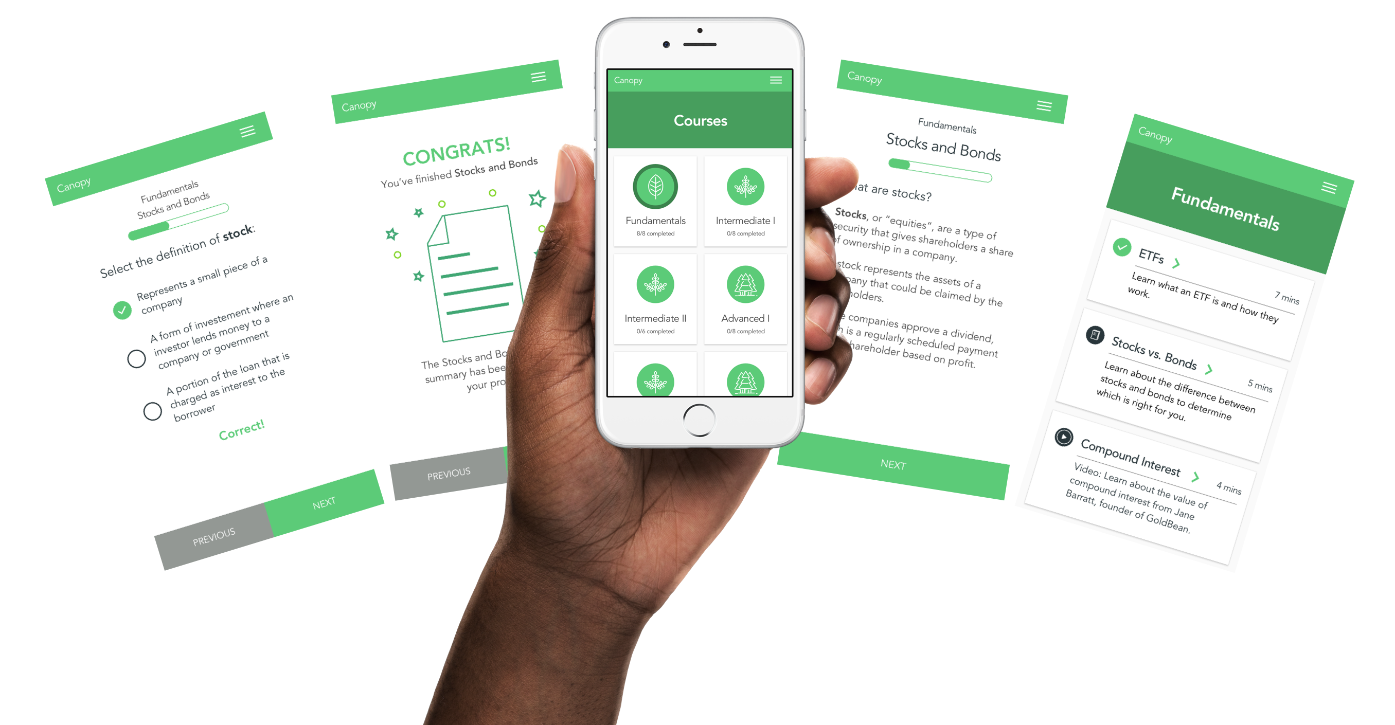
For the Roadmap, we started to develop concepts with a Card UI, progress levels for each course, and icons for each course. For the Lessons, we converged on the idea of dividing the lesson into small pieces, incorporating quiz questions, and some sort of lesson summary.
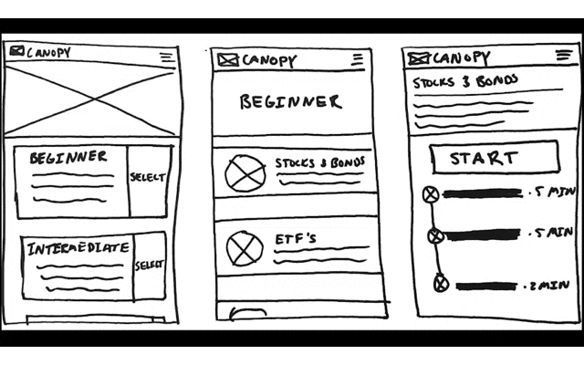
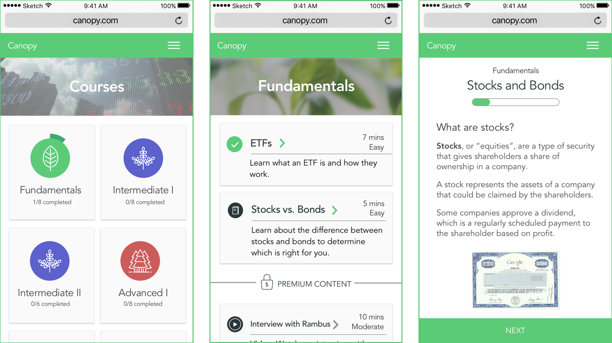
We created mid-fi mockups, made provisional visual design choices, defined a taskflow, and built a prototype. The mid-fi mockup incorporated the elements we converged on in the ideation phase and started to have a more cohesive visual look.
· · ·
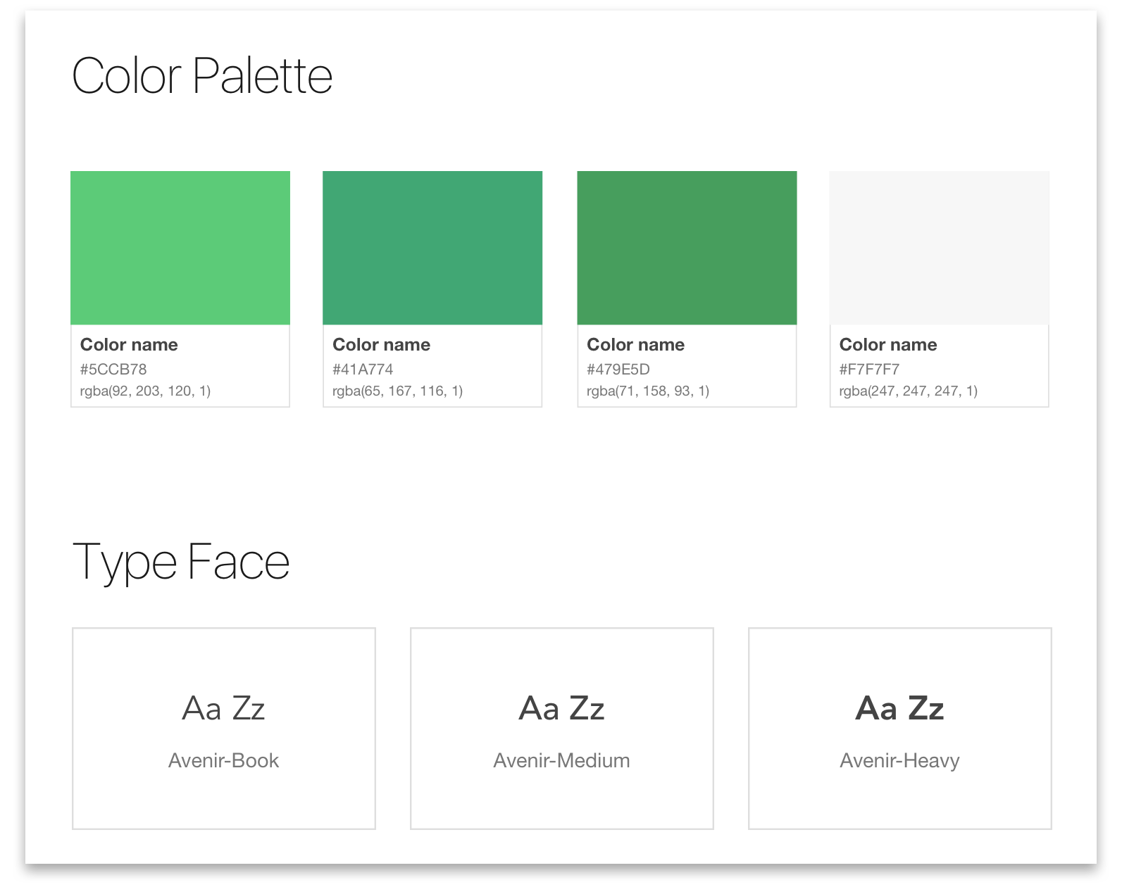
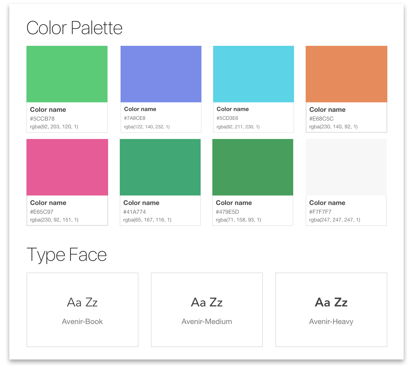
The initial color palette we looked at was colorful, yet grounded. It had a primary green color with some complementary and analogous options to support it. We also decided on Avenir as the font for Canopy. The typeface is friendly, while still serious and authoritative.
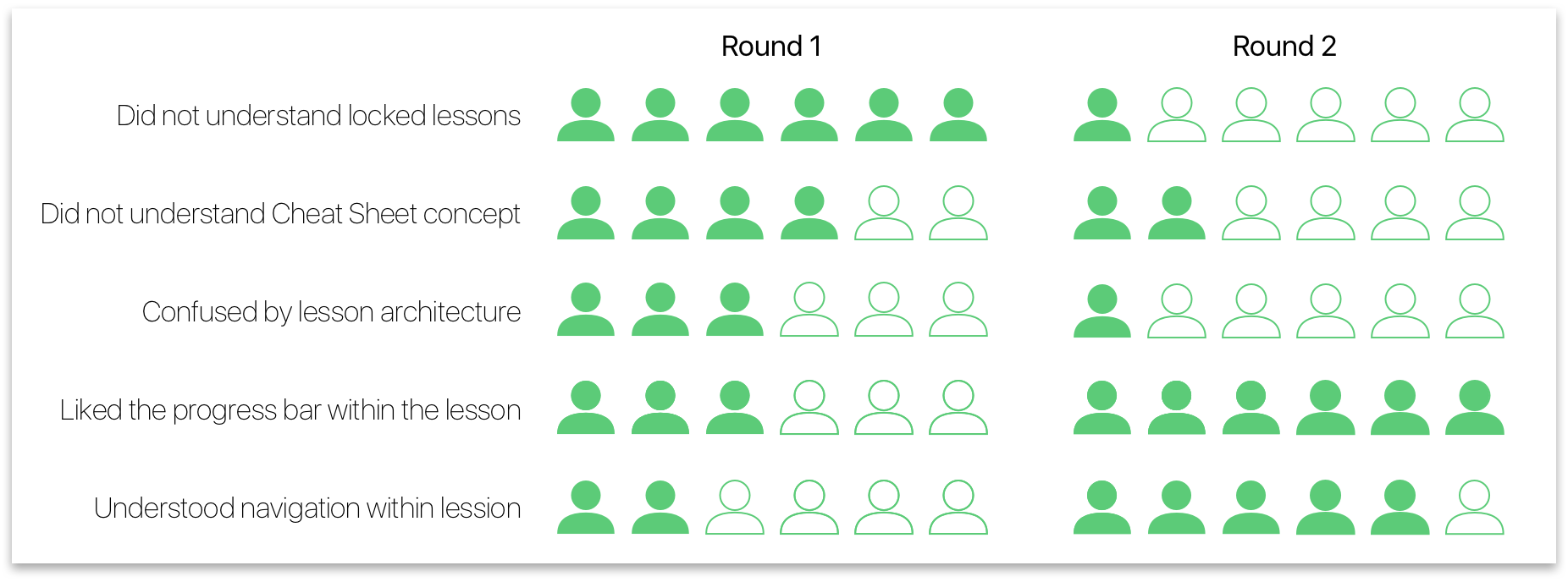
For the first round of usability testing, we created a clickable prototype and interviewed 6 people within Canopy’s demographic. Some of the main insights were that people did not understand the locked lessons or the concept of the cheat sheet and were slightly confused by the lesson architecture. There were many positive responses to the progress bar within the lesson.
· · ·
Using the results gathered from round 1, we iterated and conducted a second round of usability testing with a high-fidelity prototype. In this iteration we decided to remove the color from the key term as well as the quit button.
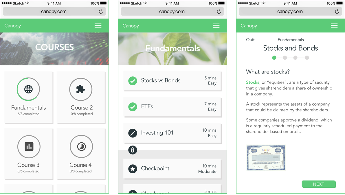
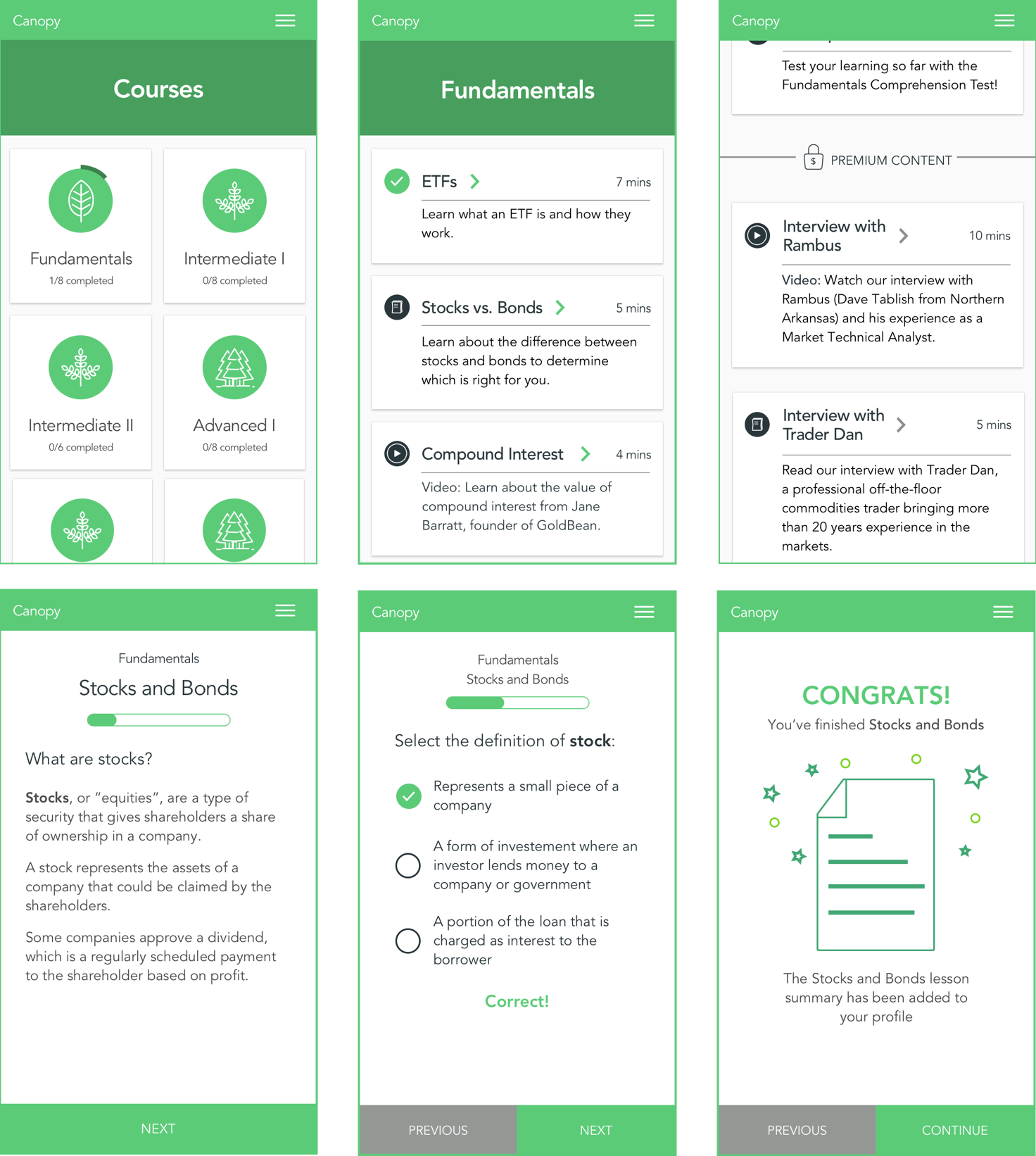
Finally, hi-fi mockups were created which incorporated the insights from earlier usability testing.
· · ·
Additionally, a final color palette using only an analogous scheme was chosen in order aid in scalability.