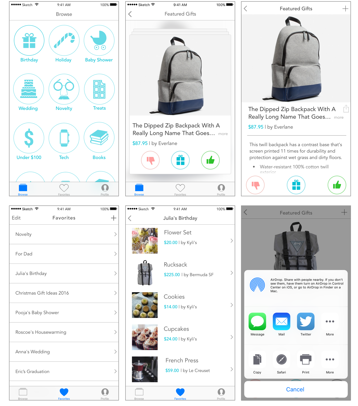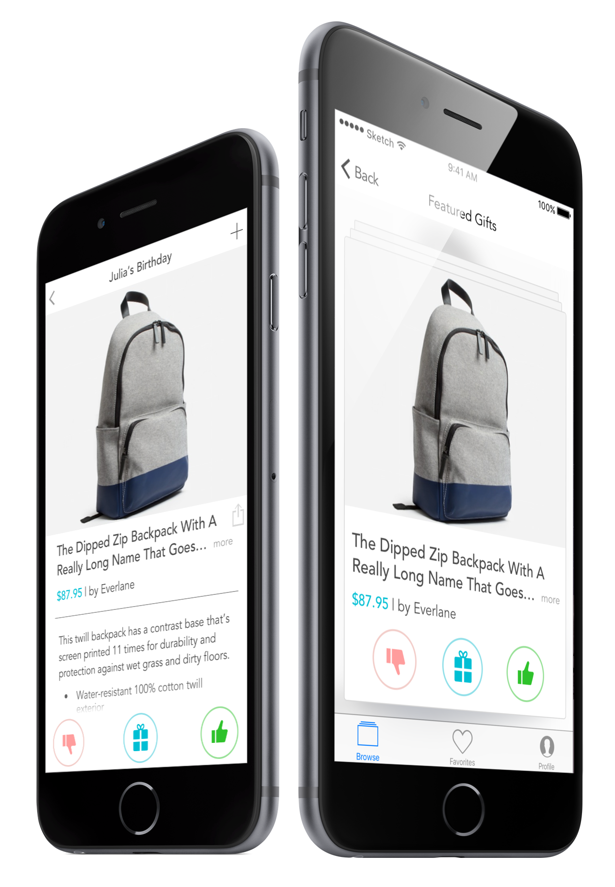
Glifft is a “thoughtful gifting” service. It assists users in giving more thoughtful gifts by providing recommendations generated through hybrid intelligence.
Finding good gifts is hard. Using Artificial Intelligence adds the ability to provide the user with unique and customized gift ideas.
In addition to working through the user experience, I developed the brand identity and interface components.
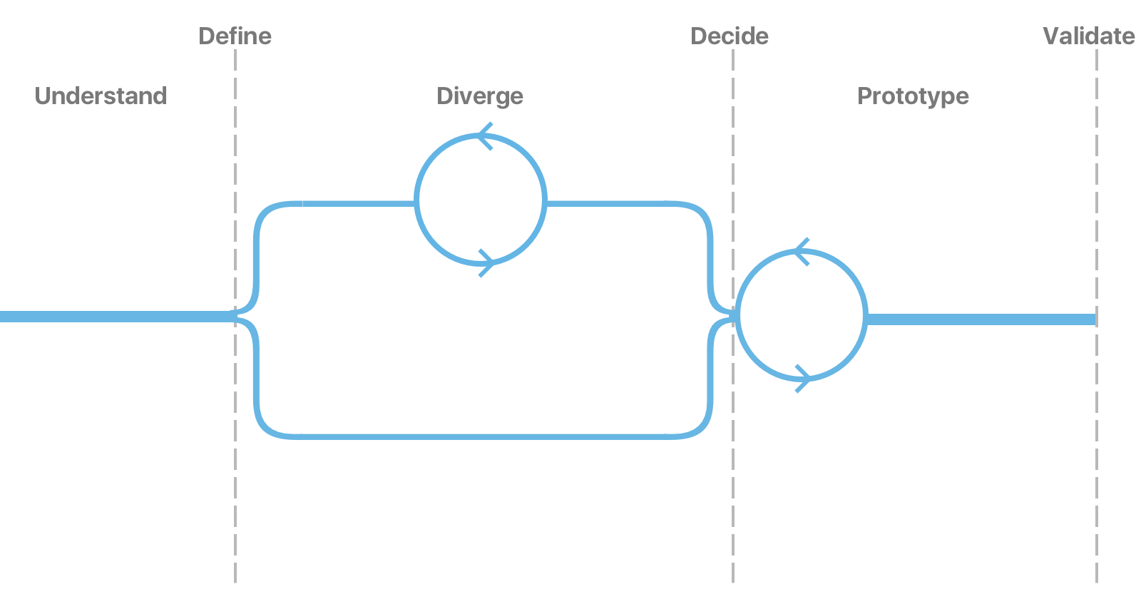
When thinking about the process the team wanted to follow, we explored many options but ultimately landed on the Google Ventures Design Sprint. This was do to the rapid pace in which the team could make decisions. The following diagram shows how we were able to configure the model to match our particular needs.
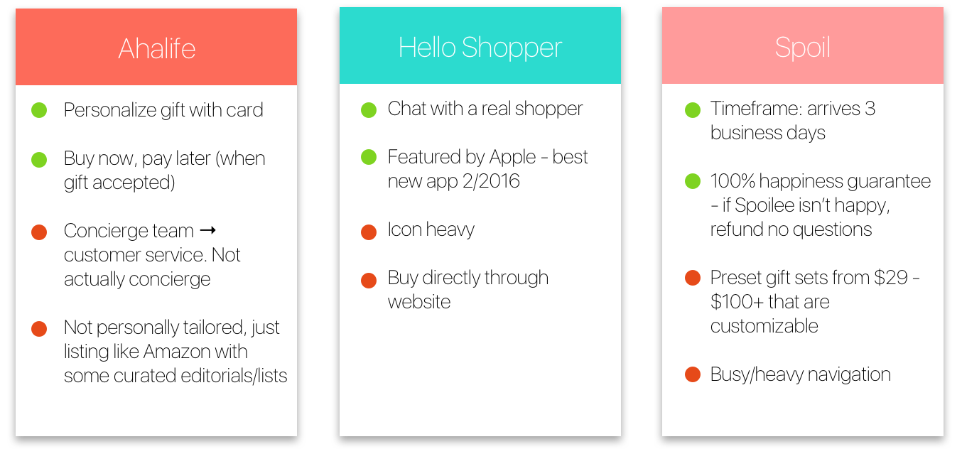
In order to understand the current market for online gifting we looked at various competitors offerings. By using these products we were able to extract components that we did and did not like.
To understand the business goals and technological limitations the team conducted several rounds of discussion sprints:
Using the data we collected from the research phase, we created a user persona. This process is done in order to develop an accurate representation of the behaviors and goals of the typical users. We then created a design story for our persona.This ensured that all future design decisions were in-line with our prototypical user.
At this point, our research began to diverge from the clients original assumption-people gift everyday. To objectively determine user behavior we employed lean methodology to rapidly test our risky assumptions in a hypothesis + experiment format.
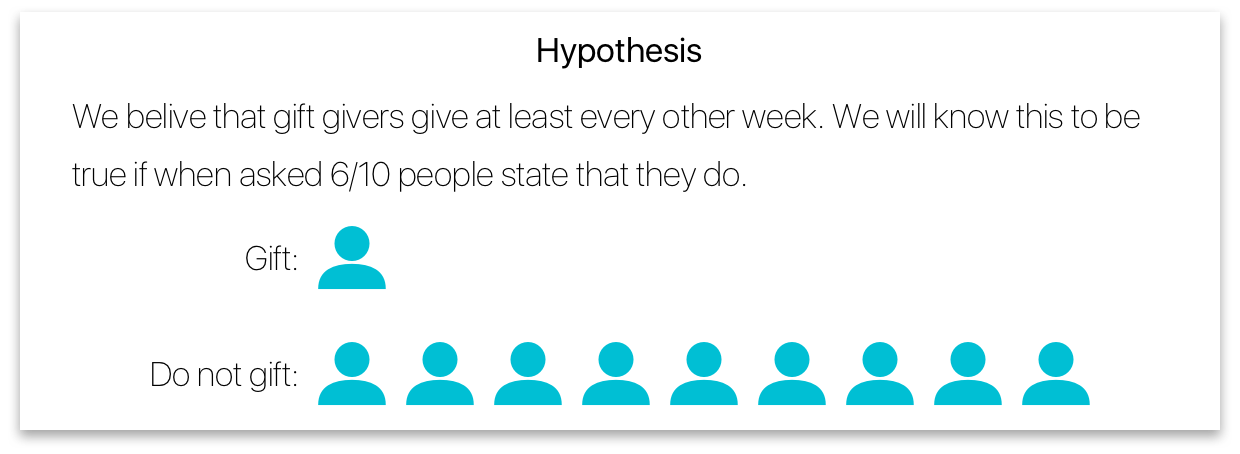
It was at this time that the team evaluated the findings from user research and decided to switch from the idea of "everyday gifting" to casual, social consumption (think Instagram, Tinder, Facebook)
During the brainstorming process we narrowed in on the following top 3 concepts.

We created low-fi mockups which incorporated the elements we converged on in the ideation phase.
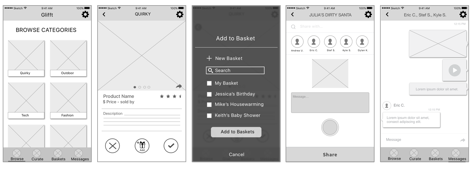
As a team we were able to step back and realize that the concepts presented were not MVP (Minimal Viable Product). It was at this time that we decided to remove features such as Chat, and "Baskets" in order to simplify the product.
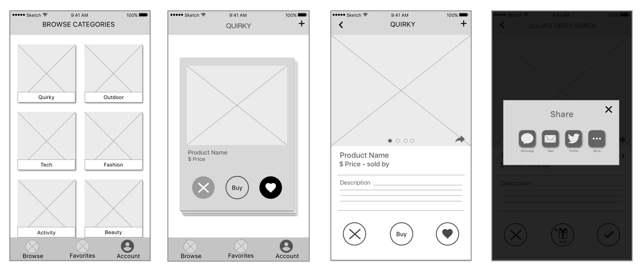
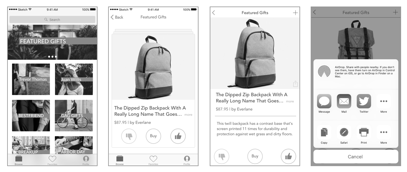
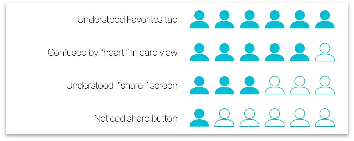
In order to learn from usability testing, we created a clickable prototype and interviewed 10 people within Glifft's demographic. Some of the main insights were that people were confused by the heart and "X" swiping actions. In addition, they could not find the share button.
Finally, hi-fi mockups were created which incorporated the insights from earlier usability testing.
